Choosing Paint is Crazy-Making
/
"It's just paint!"
I have long exclaimed this phrase to friends and family needing support through their painting process.
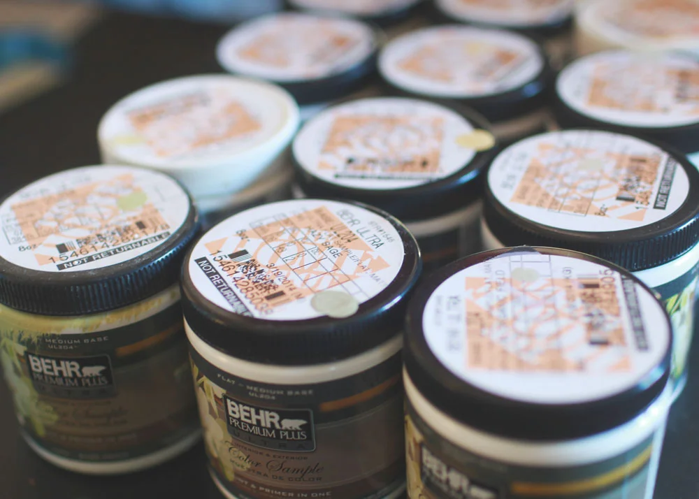
"Stop fretting! Just do it! If you don't like it...you can always change it." Well, yes. All of that. However, now that it's MY house and MY time, I'm singing a different tune. As you can see from my large collection of sample pots, I've been spending a bit of time trying to decide.
I told you about our IKEA drama. And how the IKEA white cabinets won't match our white walls. I was sad. I cried. But I moved on...because I LOVE grey and white. And that's what we decided to do. It turns out Matt didnt LOVE the stark white everywhere anyway. My kitchen will still be mostly white because I'm doing subway tiles on the walls...but the grey will help to warm up the living room in a wonderful way.
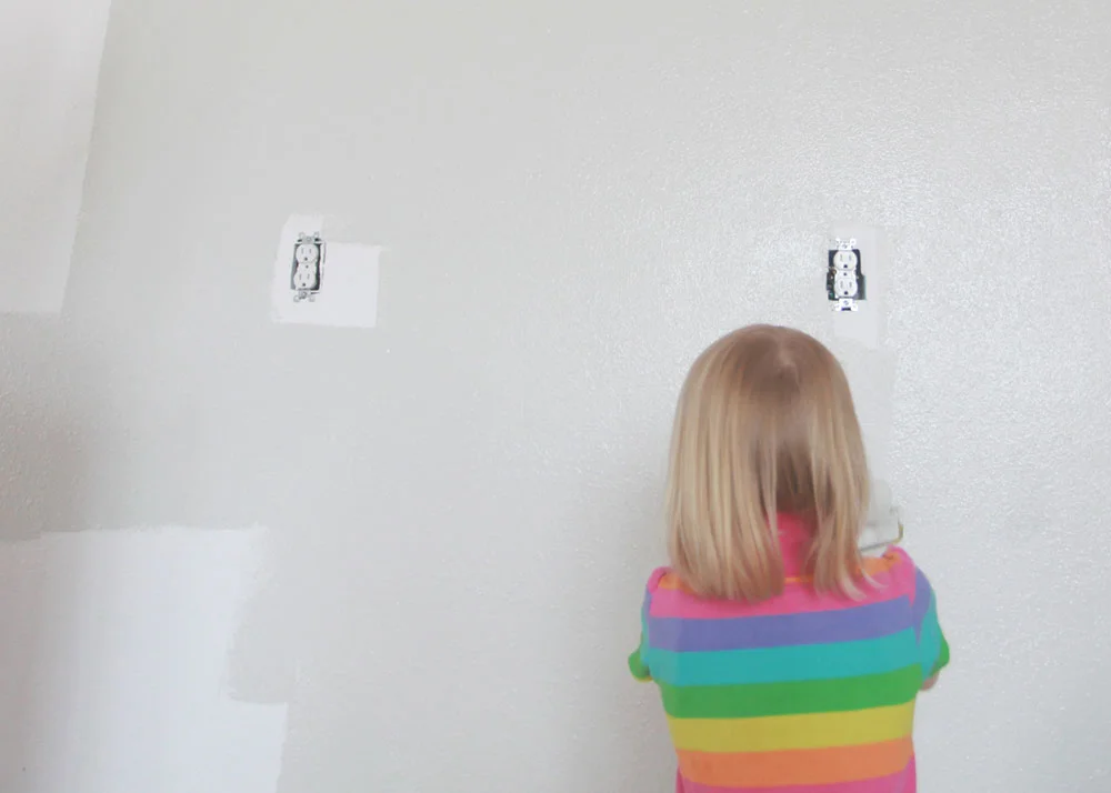
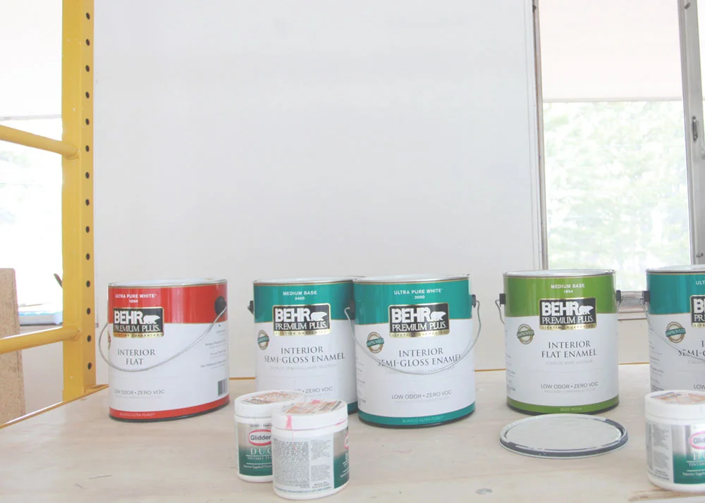
We chose Martha Stewart Heavy Goose in Behr flat enamel, and brought home a little pot to sample on the wall. Because the light in our space changes every 1, 254 times a day, I knew that I needed to actually paint the color on the wall and not just bring home the paper sample. So I painted this little square, along with a few other accent colors.
We liked the lightness and tone (or so we thought)...so we went for it and bought a 5 gallon bucket. Oy. I think you know where this is going. Matt spent all morning painting. When I saw it all done, on every wall...in all the lights of the day...I hated it. *sob face*
It was super light. Almost white in some light...but not quite white. More like an icy baby blue. Let me repeat that. ICY BABY BLUE. In my largest living space. I tried my best to soften the blow when I told Matt. He was NOT happy. Understandably.
I gave him a day to consider my new ideas...and eventually he agreed that it was a bit too blue. Although, he probably would have left it and just lived with it. But because is amazing...he said,
"I will re-paint it. For you. Because I love you."
"Ohhhhhh thank you thank you thank you!" I exclaimed. And then I got busy looking for other greys. I thought I had done my research the first time, but apparently not enough. Because there are unlimited grey paint options and a zillion blog posts about it. I knew I had a little more investigating to do. There are so many tones of grey. Purple, green, yellow, neutral...but it all depends on your space and light, so one size does not fit all.
After all my research, I settled on Porpoise by Behr. I loved how it looked in this house. So I brought a pot home, along with the lighter version of it on the palette. Foiled again! It initially looked good wet, but when it dried it looked so dark and purply! I couldn't believe how different it looked.
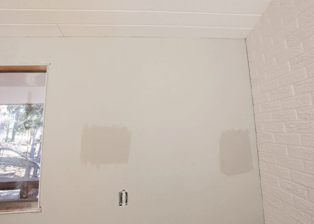
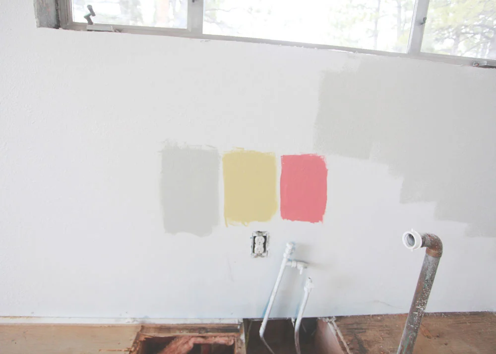
I started looking through my sample pots and found one that I liked. I put up SIX sample sections...all around the room in different light. I Pinterested. I Googled. I sat and stared.
I stared at it while I sipped my coffee.
I squinted at it in the mid-morning light.
I gazed at it in the afternoon glow.
And I laid on the floor after supper.
Looking. Looking. Looking.
And after all that, I said "I THINK this is the one!". Matt doesn't like to be standing at the paint counter ordering and have me say "I THINK...". But we went for it.
Nimbus Cloud by Martha Stewart is our color!
You can see it on the wall above...those two samples are Nimbus Cloud. And you can sort of tell that the other grey on the wall was that nice icy blue. Hard to capture it's glory in a photo. It's a nice neutral grey. If it has any color at all, it might be a teensy bit of green. But I like how it looks next to the white fireplace.
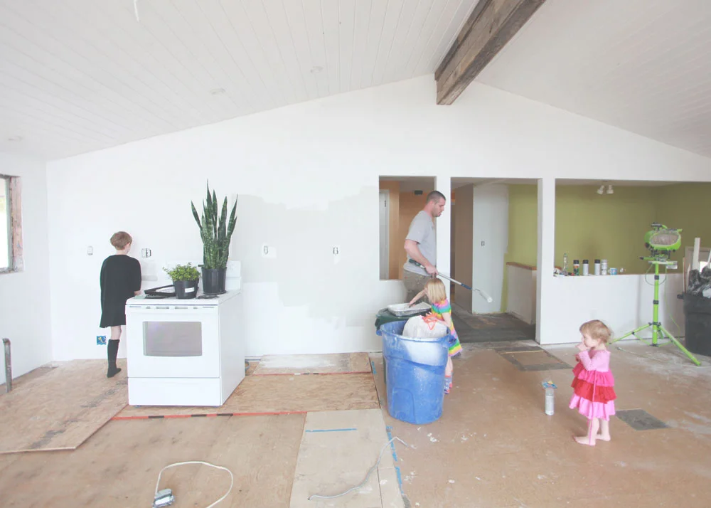
As I type this, Matt is busily painting away. He just finished the first coat and it looks good. So happy to be moving forward.
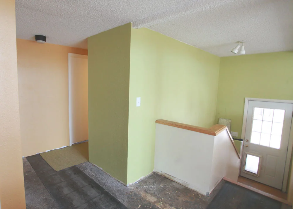
In other painting news, we painted the hallway! Green and yellow! Then...wait for it...I changed my mind! The green felt too cold and sage-like (Wheat Grass by Behr). And the gold color got REALLY dark gold at night and was muted orange-y by day (Cork by Behr) And it felt like every other space we've ever lived in. Which for some people is a good thing...but I'm ready for a change.
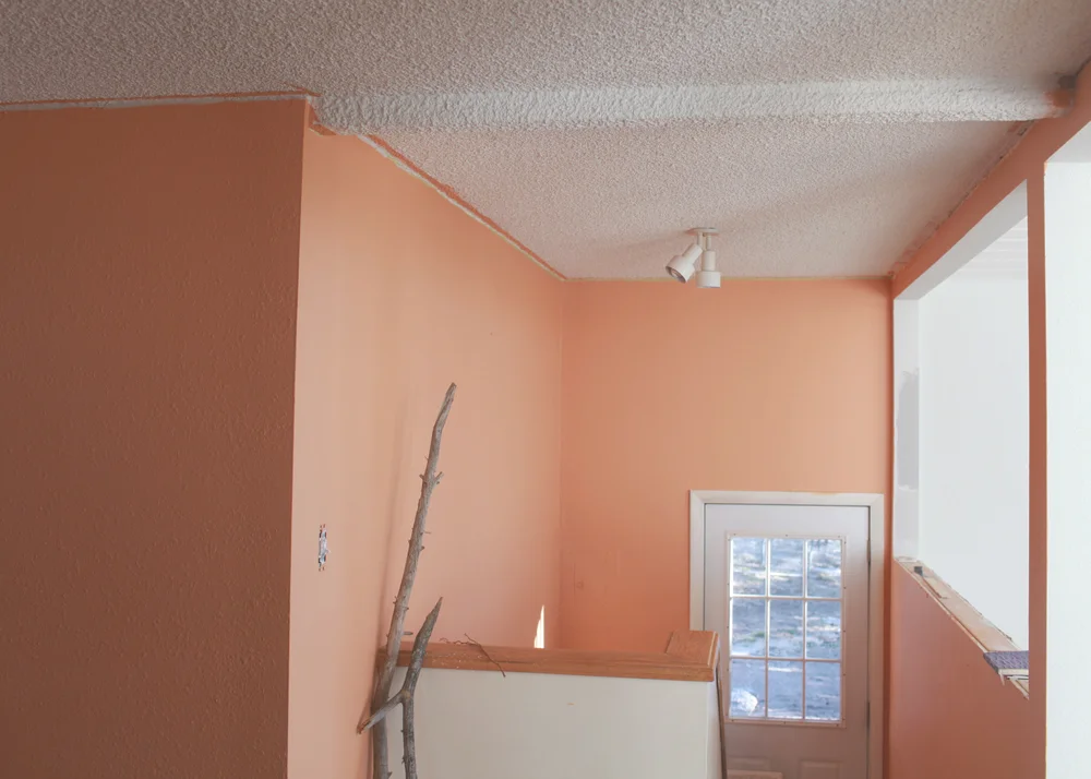
So we went for something totally different. Toasted Coconut by Glidden. I love it. It feels like a warm hug. From Olaf. I love how it looks with the grey and white. This is the lightest it gets...and then gets darker throughout the day.
I'm going to paint the door a contrasting color...maybe green or yellow. And we are contemplating barnwooding that entire wall around the door. The wall going down the basement steps will be covered with big and small white frames with yummy art. The ceiling will be the same white painted wood that is on the living area ceiling.
On the little half-wall and down the steps, I'm dreaming of some funky wallpaper. What are your favorite wallpaper sources?
Yes, it's bold. And it's not for everyone. But it's US. I can't wait to get curtains and art and furniture in here so I can stop obsessing about paint and move on to obsessing about accessories. Plus, adding all of those things will radical change how it all looks and feels.
The master bedroom is painted now as well...and I AM IN LOVE. I just found my dream bedspread on Etsy...a 1940's vintage piece. I'm working the entire room around that. Eeeeeep! I'm waiting until it's all done to show you...neener neener ;-)
So...the paint is nearly done. The gas line is getting run tomorrow. All the little things that have to happen before we can put it back together are happening. There are so.many.little.things. We are hoping to start laying down flooring late next week and then it will all move pretty quickly after that. We hope.
In the end...it is just paint. Crazy-making paint. Relationship-building paint. Self-discovery paint. I'm glad that little journey is over!